Designing a transparent and unified customer support platform
TIMELINE
3 weeks
MY ROLE
Qualitative research,
UX Design,
Visual/UI
TEAM
Shruti Shah
Sumit Sharma
+2 developers
Freshday
TOOLS

LINK
CONTEXT
About OneCard
About the project
Credit cards haven't changed much for over half a century so OneCard is meant to redefine the credit card for the new age consumer.
The result is a credit card re-imagined for the mobile first generation. Backed by the principles of simplicity, transparency, and giving back control to the user.
Problem
Customers felt helpless as they could not get their disputes resolved through “Contact Us”
Impact
Customers dropping off, all social handles filled with disputes
Goals
How might we responsibly provide support to our customers and keep the communication transparent?
Research
How are customers feeling about the current “Contact Us?”
Customer complains on social channels
User Interviews
1:1 INTERVIEWS
Include inquiries about payment due dates, amounts, schedules, bank accounts used, interest charges, payment confirmations, outstanding balances, and document requests.
QUESTIONS ASKED
How you tried our customer support feature?
How long does it take to resolve an issue?
How many times do you check email linked to OC?
Have you faces any issue with our customer support?
Do you think anything can be improved to make it better?
PARTICIPANTS
20 customers from all over India
User quotes
After understanding member support agents' insights and common member inquiries, we delved deeper to identify gaps in the existing experience.
Govind Kumar (36)
“I don’t check my emails everyday so I miss out on the status of my disputes. It is hard to keep a track.”
Samita Shetty (29)
“My payment is stuck for days and nobody replies on the emails so I want to deactivate my account.”
Harjyot Chavan (25)
“Traditional banks at least have a physical office that I can turn to, this feels like a fraud to not able to seek help”
Atul Karmakar (45)
Pain points
😞
The resolution time for each dispute took > 10 days
The main concern that most customers brought up was long resolution time and they could not estimate the time either. The agents were not capable enough to resolve it through emails.
😞
Customers don’t often check their emails
14/20 customers said that they don’t check their personal inbox on a daily basis so they would often miss out or the email get’s lost with a bunch of other emails. They could not track the whole conversation.
😞
If the customers have a quick query about the app or a feature they have to write an email for the same every time. The process gets tiring and so they stop using the app.
😞
They are unable to have human interaction
The customers feels that they are talking to a bot sending out automated emails whereas they would want to hear a human voice when they feel helpless to feel reassured.
Define
After understanding customer insights and common user inquiries, we delved deeper to identify gaps in the existing experience.
Accessing the current scenario
Problem 1
The contact us is not given enough importance on the app and gets lost in the last fold of the profile section.
Problem 2
The “Contact Us” card comes as an overlay on the profile section with just the email ID of OneCard mentioned which leaves with a customer with no option but to write an email and wait for the reply.
Problem 3
There is everything wrong with the copy which does not help a customer in distress. It doesn’t give any direction on what to do in case of serious issues like fraud and misplaced card. To top that off the button says done.
Getting every detail right
The PM and I collaborated at this stage where we came up with feature requirements and different approaches to the solution based on that.
Customer Control
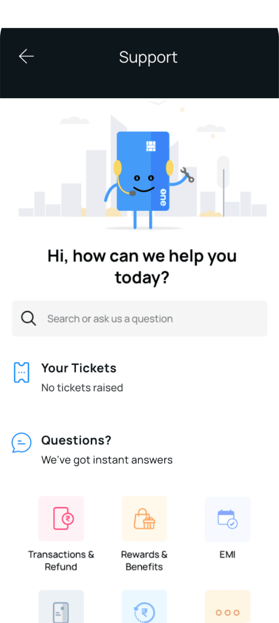
Customers should have control over the customer support dashboard, so we wanted to give them a platform where they can raise, track, reply and resolve their tickets/disputes seamlessly.
Instant Answers
We wanted to provide instant answers to our customers without overwhelming our CX agents with customer calls. Launching a FAQ section in the app with the most commonly asked questions was the way to resolve quick queries easily.
A Human Touch
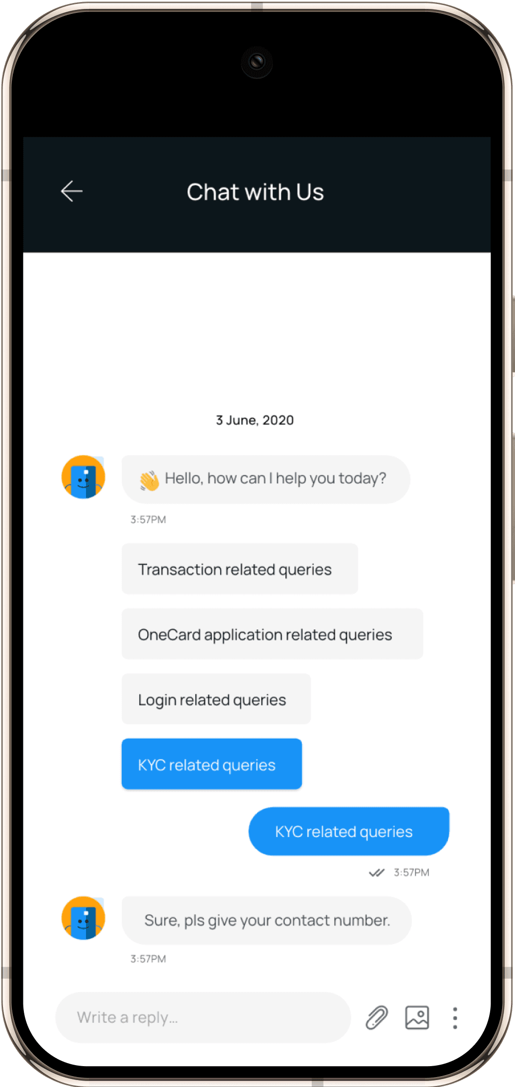
A lot of our customers complained that the emails they were receiving were automated and felt they were talking to a bot. To solve that, we committed to support our brand expression of being transparent and not sound deaf and robotic. Even when we leverage programmatic messages, they should feel human and unique.
One call away
Reminding our customers that we are just one call away by going that extra mile and adding a toll free contact number on the app for a certain time during the working hours and days of a CX agent.
User journey mapping
We mapped each stages to identify how a user will travel through raising a ticket and getting it resolved. In this scenario we mainly considered the happy/ideal flow to get started.
Happy path from raising a ticket to closing a ticket
Explorations
I created multiple versions to perfect the design. In the first iteration, integrated a chatbot, FAQ, and call option to centralize user support. In the second, streamlined navigation by relocating "Contact Us" to the homepage, introducing a call option on the dashboard, and embedding FAQs within the chatbot for a cleaner interface.
User testing
To test/validate the second iteration we went ahead with interviewing 10 cardmembers with our prototype.
Confusion around raising tickets and it’s existence
“The tickets are suddenly coming up after chat option. What are ticket? How to open a ticket? What will chat option do?”
Inclination towards direct calling option
“I would call OneCard to solve my issue directly. Talking to someone is assuring”
“Having chat/call is really helpful. It don’t have to send emails and wait forever”
“Can we do like amazon after 5 PM? They have a callback option on the app”
Discovering the flaws
Excessive clicks on Call Us
We didn't anticipate users heavily using "Call Us," but nearly 9 out of 10 did. To prevent overwhelming our agents, we introduced an eligibility checkpoint for calls, given OneCard's large user base.
Differentiating tickets and chat
Users started differentiating between tickets and chat with us as different support options. It was confusing for a user to raise a concern without understanding the concept.
Final outcome
Defining all use cases and how the user would navigate through the screens.
Collaborating with Freshdesk
Impact
Happy Customers!
Our social team noticed a drop in negative responses on social media. Most users starting raising tickets from the app than social handles.
3.75 avg score on CSAT
The feedback form showed results that the
customers were relatively happy about the new ticket management system.
Learnings


